Since you brought it up ManCandy,

The HUD change could be a little better in many ways for the group list.
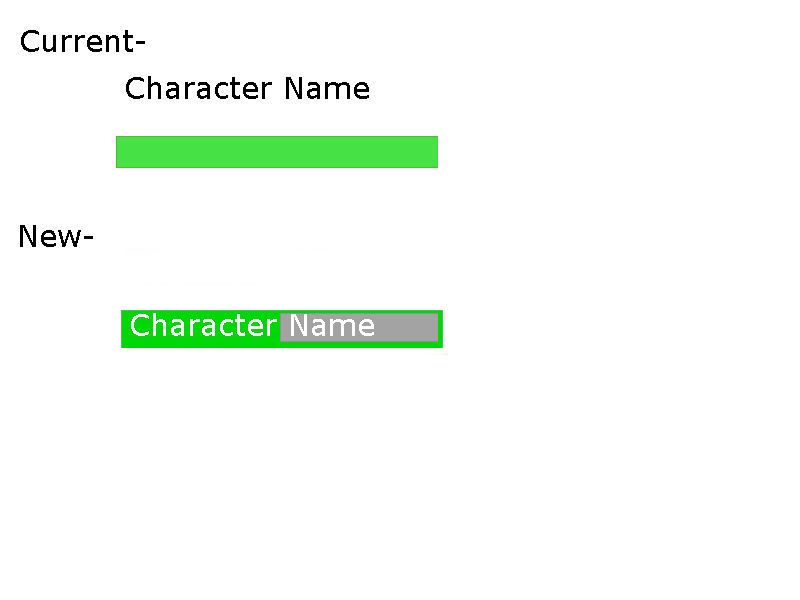
1. Character names already exceed the health bar length in many cases (more player fault than HUD)
2. You can see health, but what about energy (for mages to monitor when to cast energy boost)
3. Need to keep a vertical limit on minimum size for the players that have to pick from this list (we don't all have iPads and personally I'm ALL THUMBS, lol)
4. Then (to be fair) there are those that are color challenged (green is a very bright version of grey for them). It would be like trying to read white text on a newspaper.
Ideally, make a quick patch to make it better for now and then improve the design on the next full update.
(two cents, well intentioned)